Bayesian linear regression
Contents
Bayesian linear regression#
Author: Zeel B Patel
import numpy as np
import pandas as pd
import matplotlib.pyplot as plt
from matplotlib import rc
from matplotlib.animation import FuncAnimation
from mpl_toolkits import mplot3d
from jax import numpy as jnp, scipy as jscipy
from jax import grad
import scipy.stats


rc('font',size=16)
rc('animation', html='jshtml')
We know the formulation of the simple linear regression for feature matrix \(X\) and target vector \(\mathbf{y}=[y_1,y_2,..,y_N]^T\),
In Bayesian settings, we can define the Linear regression as following,
Where, \(\sigma_n^2\) is noise variance and \(\sigma^2\) is variance in parameters (\(\theta\)).
Bayesian linear regression (1D without bias)#
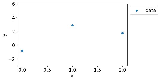
Let’s consider this simplest case first. Consider the following dataset with \(3\) points.
np.random.seed(2)

plt.figure(figsize=(8,4))
N = 3
x = np.linspace(0,2,N).reshape(-1,1)
t = 3
sigma_n = 2
y = t*x + np.random.multivariate_normal(np.zeros(N), np.eye(N)*sigma_n**2).reshape(-1,1)
plt.scatter(x, y, label='data');plt.xlabel('x');plt.ylabel('y');
plt.ylim(-3,6);plt.legend(bbox_to_anchor=(1.3,1));
plt.tight_layout()
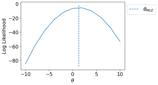
MLE for \(\theta\)#
Now, we should be able to appreciate the effectiveness of MLE as we can find such \(\theta\) so that our likelihood of observing given data \(D=\mathbf{y}\) is maximized.
This turns out as the same cost function in linear regression.
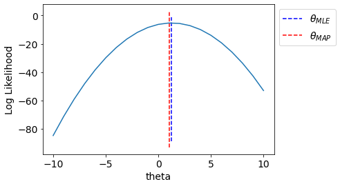
Let us visualize the likelihood pdf for various values of \(\theta\) and plot \(\theta_{MLE}\).
def LogLikelihood(y, x, theta):
    N = x.shape[0]
    return np.log(scipy.stats.multivariate_normal.pdf(y.ravel(), (theta*x).ravel(), np.eye(N)*sigma_n**2))

T = np.linspace(-10,10,11)
LL = [LogLikelihood(y, x, t1) for t1 in T]
fig, ax = plt.subplots()
ax.plot(T, LL);
ax.vlines(np.sum(x*y)/np.sum(np.square(x)),*ax.get_ylim(), linestyle='--', label='$\\theta_{MLE}$')
ax.set_xlabel("$\\theta$");ax.set_ylabel("Log Likelihood");
plt.legend(bbox_to_anchor=[1,1]);
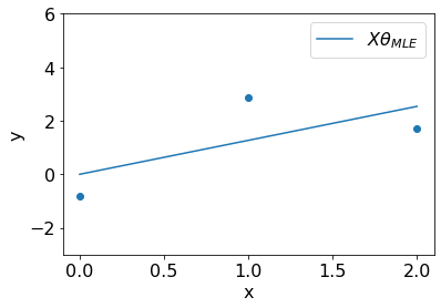
We can visualize the fit resulted by \(\theta_{MLE}\) on the dataset.
np.random.seed(1)

plt.scatter(x, y);plt.xlabel('x');plt.ylabel('y');
t_mle = np.sum(x*y).squeeze()/np.sum(np.square(x)).squeeze()
plt.plot(x, t_mle*x, label='$X\\theta_{MLE}$');plt.ylim(-3,6);
plt.legend();
Note that we can achive similar fit with gradient descent on negative log likelihood (same as cost function) as illustrated below.
def JLogLikelihood(y, x, theta):
    N = x.shape[0]
    return jnp.log(jscipy.stats.multivariate_normal.pdf(y.ravel(), (theta*x).ravel(), jnp.eye(N)*sigma_n**2))

costs = []
thetas = []
theta = 10.
lr = 0.1

grad_func = grad(JLogLikelihood, argnums=[2])
for iteration in range(20):
    dt = -grad_func(y, x, theta)[0]
    theta = theta - lr*dt
    costs.append(-JLogLikelihood(y, x, theta))
    thetas.append(theta)

rc('font',size=14)
fig, ax = plt.subplots(1,2,figsize=(10,4))
def update(i):
    ax[1].cla();ax[0].cla();
    ax[0].plot(T, -np.array(LL),color='b')
    ax[0].set_xlabel('$\\theta$');ax[0].set_ylabel('Neg Log Likelihood');
    ax[0].scatter(thetas[:i+1], costs[:i+1], label='Solution',c='r')
    ax[0].legend()
    ax[1].scatter(x,y)
    ax[1].plot(x, thetas[i]*x, label='$X\\theta$')
    ax[1].set_xlabel('x');ax[1].set_ylabel('y');
    ax[1].legend()
    ax[1].set_ylim(-5,16);
    plt.tight_layout()

plt.close()
anim = FuncAnimation(fig, update, range(20))
anim
WARNING:absl:No GPU/TPU found, falling back to CPU. (Set TF_CPP_MIN_LOG_LEVEL=0 and rerun for more info.)
<Figure size 432x288 with 0 Axes>
MAP for linear regression#
We have assumed a Gaussian distribution over \(\boldsymbol{\theta}\) because likelihood is Gaussian (conjugate priors).
sigma = 2
Let us draw multiple samples from the prior distribution.
fig,ax = plt.subplots(1,2,figsize=(8,4))
np.random.seed(2)

sample_size = 20

prior_theta = np.linspace(-8,8,200)
samples = np.random.normal(0, sigma, size=sample_size)

rc('font',size=14)
def update(i):
    for axs in ax:
        axs.cla()
    ax[0].plot(prior_theta, scipy.stats.norm.pdf(prior_theta, loc=0, scale=sigma), label='pdf')
    ax[0].set_xlabel('$\\theta$');ax[0].set_ylabel('pdf');
    ax[0].scatter(samples[i], scipy.stats.norm.pdf(samples[i], loc=0, scale=sigma), label='sample')
    ax[0].legend()
    ax[1].scatter(x,y)
    ax[1].plot(x, samples[i]*x, label='$X\\theta$')
    ax[1].set_xlabel('x');ax[1].set_ylabel('y');
    ax[1].legend()
    ax[1].set_ylim(-4,16);
    ax[0].set_xlim(-8,8);
#     plt.tight_layout()
plt.tight_layout()
plt.close()
anim = FuncAnimation(fig, update, range(sample_size))
anim
Now, we will find MAP estimate incorporating the prior.
def get_MAP(sigma=sigma, sigma_n=sigma_n):
    return (np.sum(x*y)/(np.sum(np.square(x))+(sigma_n**2/sigma**2)))

T = np.linspace(-10,10,21)
LL = [-LogLikelihood(y, x, t1) for t1 in T]
fig, ax = plt.subplots()
ax.plot(T, -np.array(LL));

ax.vlines(np.sum(x*y)/np.sum(np.square(x)),*ax.get_ylim(),linestyle='--',label='$\\theta_{MLE}$',color='b')
ax.vlines(get_MAP(),*ax.get_ylim(),linestyle='--',label='$\\theta_{MAP}$',
          color='r')
ax.set_xlabel("theta");ax.set_ylabel("Log Likelihood");
plt.legend(bbox_to_anchor=[1,1]);
We see that MAP incorporated effect of prior.
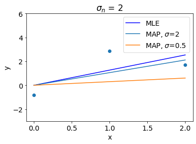
Let us see other interesting insights. Following plot shows that higher value of \(\sigma\) denotes weak regularization and thus MAP gets closer to MLE if \(\sigma\) is too high.
np.random.seed(1)

plt.scatter(x, y);plt.xlabel('x');plt.ylabel('y');
t_mle = np.sum(x*y)/np.sum(np.square(x))
plt.plot(x, t_mle*x, label='MLE', color='b')
t_map = get_MAP()
plt.plot(x, t_map*x, label=f'MAP, $\sigma$={sigma}')
t_map = get_MAP(sigma=0.5)
plt.plot(x, t_map*x, label=f'MAP, $\sigma$={0.5}')
plt.ylim(-3,6);
plt.legend(bbox_to_anchor=(1,1));
plt.title(f'$\sigma_n$ = {sigma_n}');
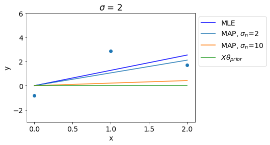
In contrast to that, Higher value of \(\sigma_n\) denotes stronger regularization and thus for high values of \(\sigma_n\), MAP gets close to the prior mean.
np.random.seed(1)

plt.scatter(x, y);plt.xlabel('x');plt.ylabel('y');
t_mle = np.sum(x*y)/np.sum(np.square(x))
plt.plot(x, t_mle*x, label='MLE',color='b')
t_map = get_MAP()
plt.plot(x, t_map*x, label=f'MAP, $\sigma_n$={sigma_n}')
t_map = get_MAP(sigma_n=10)
plt.plot(x, t_map*x, label=f'MAP, $\sigma_n$={10}')
plt.plot(x, x*0, label='$X\\theta_{prior}$')
plt.ylim(-3,6);
plt.legend(bbox_to_anchor=(1,1));
plt.title(f'$\sigma$ = {sigma}');
Bayesian linear regression (1D with bias term)#
Now, we will programatically explore MLE and MAP for 1D linear regression after including the bias term.
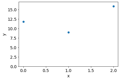
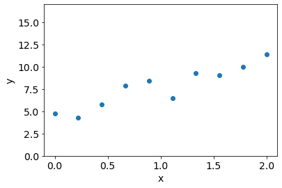
Consider a dataset with 3 points as the following,
np.random.seed(0)
N = 3
x = np.linspace(0,2,N).reshape(-1,1)
sigma_n = 2

t0, t1 = 3, 4
sigma_n = 5
y = t0 + t1*x + np.random.multivariate_normal(np.zeros(N), np.eye(N)*sigma_n**2).reshape(-1,1)
plt.ylim(0,17)
plt.scatter(x, y);plt.xlabel('x');plt.ylabel('y');
We get MLE and MAP as the following,
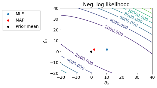
def LogLin2D(t0, t1):
    N = x.shape[0]
    return (N/2)*jnp.log(2*jnp.pi*sigma_n**2) + jnp.sum(jnp.square(y-t0-t1*x))

from mpl_toolkits.mplot3d import Axes3D
fig = plt.figure(figsize=(12,4))
ax = fig.add_subplot(121)

T0, T1 = np.meshgrid(np.linspace(-20,40,20), np.linspace(-20,40,20))
Z = np.array([LogLin2D(t00, t11) for t00, t11 in zip(T0.ravel(), T1.ravel())]).reshape(*T0.shape)
mp = ax.contour(T0, T1, Z, levels=10);
plt.clabel(mp);
ax.set_xlabel('$\\theta_0$');ax.set_ylabel('$\\theta_1$');
ax.set_title('Neg. log likelihood');
x_extra = np.hstack([np.ones((x.shape[0], 1)), x])
t0_mle, t1_mle = np.linalg.inv(x_extra.T@x_extra)@x_extra.T@y
t0_map, t1_map = np.linalg.inv(x_extra.T@x_extra + np.eye(x.shape[1])*(sigma_n**2/sigma**2))@x_extra.T@y
# ax.annotate('GT', (t0, t1))
ax.scatter(t0_mle, t1_mle, label='MLE');
# ax.annotate('MLE', (t0_mle, t1_mle))
ax.scatter(t0_map, t1_map, label='MAP',c='r');
# ax.annotate('MAP', (t0_map, t1_map))
ax.scatter(0, 0, label='Prior mean',c='k');
# ax.text(-4,0, 'Prior mean')
ax.legend(bbox_to_anchor=(-0.2,1));
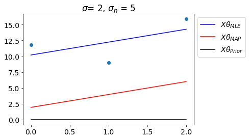
Let us see the fit with \(\theta_{MLE}\) and \(\theta_{MAP}\).
plt.scatter(x,y);
plt.plot(x, t0_mle+t1_mle*x, label='$X\\theta_{MLE}$',color='b')
plt.plot(x, t0_map+t1_map*x, label='$X\\theta_{MAP}$',color='r')
plt.plot(x, 0*x, label='$X\\theta_{Prior}$',color='k')
plt.title(f'$\sigma$= {sigma}, $\sigma_n$ = {sigma_n}')
plt.legend(bbox_to_anchor=(1,1));
The animation below shows how MAP changes as we increase the data points.
fig = plt.figure(figsize=(15,5))
ax = fig.add_subplot(131)
ax1 = fig.add_subplot(132)
ax2 = fig.add_subplot(133, projection='3d')
sigma, sigma_n = 1, 2
def update(N):
    ax.cla();ax1.cla();ax2.cla()
    np.random.seed(1)
    x = np.linspace(0,2,N).reshape(-1,1)
    y = t0 + t1*x + np.random.multivariate_normal(np.zeros(N), np.eye(N)*sigma_n**2).reshape(-1,1)
    x_extra = np.hstack([np.ones((x.shape[0], 1)), x])
    t0_mle, t1_mle = np.linalg.inv(x_extra.T@x_extra)@x_extra.T@y
    t0_map, t1_map = np.linalg.inv(x_extra.T@x_extra + np.eye(x.shape[1])*(sigma_n**2/sigma**2))@x_extra.T@y

    ax.scatter(x,y);
    ax.plot(x, t0_mle+t1_mle*x, label='$X\\theta_{MLE}$',color='b')
    ax.plot(x, t0_map+t1_map*x, label='$X\\theta_{MAP}$',color='r')
    ax.plot(x, 0*x, label='$X\\theta_{Prior}$',color='k')
    ax.set_ylim(-1,15)
    ax.set_title(f'$\sigma$ = {sigma}, $\sigma_n$ = {sigma_n}')
    ax.legend(loc='upper left');
    ax.set_xlabel('x');ax.set_ylabel('y')

    T0, T1 = np.meshgrid(np.linspace(-10,10,50), np.linspace(-10,10,50))
    Z = np.array([LogLin2D(t00, t11) for t00, t11 in zip(T0.ravel(), T1.ravel())]).reshape(*T0.shape)
    mp = ax1.contour(T0, T1, Z, levels=15);
    ax.clabel(mp);
    ax1.scatter(t0_mle, t1_mle, label='$\\theta_{MLE}$', c='b',marker='d',s=100);
    # ax.annotate('MLE', (t0_mle, t1_mle))
    ax1.scatter(t0_map, t1_map, label='$\\theta_{MAP}$', c='r',marker='*',s=100);
    # ax.annotate('MAP', (t0_map, t1_map))
    ax1.scatter(0, 0, label='$\\theta_{Prior}$',c='k',marker='o',s=100);
    ax1.set_xlabel('$\\theta_0$');ax1.set_ylabel('$\\theta_1$',labelpad=-12);
    ax1.set_title('Neg log likelihood');

    ax2.contour3D(T0, T1, Z, levels=40);
    ax2.scatter(t0_mle, t1_mle, label='MLE', c='b');
    # ax.annotate('MLE', (t0_mle, t1_mle))
    ax2.scatter(t0_map, t1_map, label='MAP', c='r');
    # ax.annotate('MAP', (t0_map, t1_map))
    ax2.scatter(0, 0, label='Prior mean',c='k');
    ax2.view_init(35, 15-90);
    ax2.set_xlabel('$\\theta_0$');ax2.set_ylabel('$\\theta_1$');

    plt.tight_layout()
plt.close()
anim = FuncAnimation(fig, update, range(2,21))
anim
<Figure size 432x288 with 0 Axes>
What are the insights here?
If we have less datapoints, \(\theta_{MAP}\) would be close to \(\theta_{Prior}\)
As we increase number of informative datapoints, \(\theta_{MAP}\) gets closer to \(\theta_{MLE}\)
If data is too noisy, \(\theta_{MAP}\) would be close to \(\theta_{Prior}\) and vice versa.
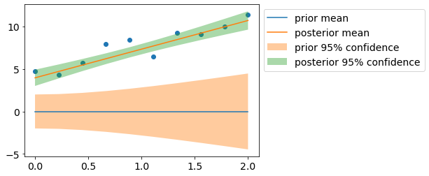
Posterior distribution over \(\theta\)#
Posterior over \(\theta\) is given as the following,
Note that \(\theta_{MAP}\) is nothing but mean of posterior distribution \(p(\theta|\mathbf{y})\).
Consider the following dataset,
np.random.seed(0)
N = 10
x = np.linspace(0,2,N).reshape(-1,1)
x_extra = np.hstack([np.ones((N, 1)), x])

t0, t1 = 3, 4
sigma_n = 1
sigma = 1

y = t0 + t1*x + np.random.multivariate_normal(np.zeros(N), np.eye(N)*sigma_n**2).reshape(-1,1)
plt.ylim(0,17)
plt.scatter(x, y);plt.xlabel('x');plt.ylabel('y');
Let us visualize prior/posterior distributions.
m_0 = np.zeros((2,1))
s_0 = np.eye(2)*sigma**2

m_n = np.linalg.inv(x_extra.T@x_extra + np.eye(2)*(sigma_n**2/sigma**2))@x_extra.T@y
s_n = np.linalg.inv((x_extra.T@x_extra)/sigma_n**2 + np.eye(2)*(1/sigma**2))

y_pr_mean = (x_extra@m_0).squeeze()
y_pr_cov = x_extra@s_0@x_extra.T
y_pr_std2 = np.sqrt(y_pr_cov.diagonal())*2

y_mean = (x_extra@m_n).squeeze()
y_cov = x_extra@s_n@x_extra.T #+ np.eye(N)*sigma_n**2 # uncomment to add likelihood noise
y_std2 = np.sqrt(y_cov.diagonal())*2

plt.scatter(x, y);
plt.plot(x, y_pr_mean, label='prior mean');
plt.fill_between(x_extra[:,1], y_pr_mean-y_pr_std2, y_pr_mean+y_pr_std2, alpha=0.4, label='prior 95% confidence');
plt.plot(x, y_mean, label='posterior mean');
plt.fill_between(x_extra[:,1], y_mean-y_std2, y_mean+y_std2, alpha=0.4, label='posterior 95% confidence');
plt.legend(bbox_to_anchor=(1,1));